Fronteers 2014 recap
A list based recap of what was said during Fronteers 2014. I was planning to just jot down some small notes, but it turned out there was a lot to write down. If you were at the conference and want to refresh your memory or if you missed it and want to have a taste, here it is.
Links to the presentations will be added as they come available.
Day 1
It’s gotta be said, Jake Archibald kicked of this conference like a pro. He talked about being nice, the location of fire exists, picking the right fire exit, being nice to fire, fire not being a requirement for a conference, no need to start a fire then. Plus, excuses were made to the people of Holland to make up for British soccer fans pissing the city walls after football matches.
To the first talk!
Getting nowhere with CSS best practices - Heydon Pickering
Heydon runs Ubuntu, which causes a little problem with the projector at first. After things get sorted out he leaves the mouse pointer in middle of the screen, I have to admit, I’ve got problems with that sort of stuff.
- CSS best practise topics overlap with overall code quality topics like readability, maintainability and flexibility.
- Are white space discussions valuable to look back on when lying on your dead bed. It’s a good thing to ask yourself. Because one day, Heydon informes us, we will die.
Mouse pointer is still in the center of the screen, how can you work like this Heydon, my god!
- We can view HTML as the interface and CSS as being “just” the branding.
- The trick is to use correct HTML elements instead of classes for everything. There’s a lot of elements out there and they bring semantics to your code. Including aria attributes like
role=“navigation”instead of.main-navmakes your HTML more accessible.
A very dramatic quote from a developer out there.
I never considered wether class ‘left’ or ‘right’ was semantic or not, but I suppose it is not. I feel like my world is falling around me.
- Use conventions, but pick the right convention for the job. Once you’ve chosen one, it often sticks till the end of a project.
- Use
role=“tab”to describe a tab element.
I wonder if a blind user understands the concept of a tab. Do we need to communicate the fact that it’s an explicit tab control instead of an on-page index?
- Use Aria states, there’s a lot of them, so there’s almost no excuse to use class names. Be careful to not misuse aria attributes though.
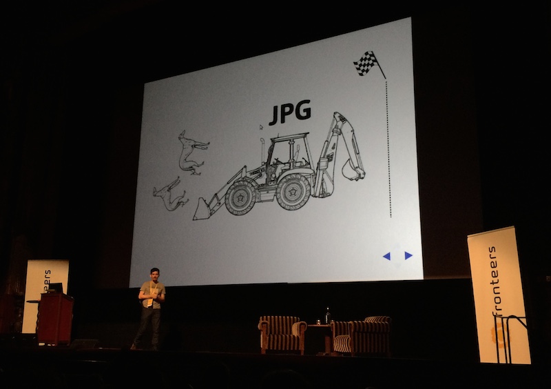
- Compares class and attribute selector performance. A Greyhound race visualisation is shown, the difference is extremely minimal at first but class takes the lead. But the moment an image is loaded it’s clear selector performance tweaking is micro optimisation.
- Links without
hrefattributes are nonsense and also cannot be focused. - An overkill of web animations and parallaxing can make people physically sick. Be kind to your users.
Web animations & parallax make people with vestibular issues sick! The only way they can turn them off is to disable CSS & JavaScript. #a11y
— Jeffrey Zeldman (@zeldman) July 25, 2014- Complexity originates from: Obligatory widgets, social media, carousels, feedback controls, all sorts of stuff that is not intended for the user and/or has not been usability tested.
- Heydon rearranges pages in an actual George Orwell’s book Nineteen Eighty Four illustrating that content turns into garbage when structure breaks down.
- 400+ links on Sky Sports website, not one of them has a focus outline, also no underline, a lot of the links are black. A family member of Heydon has Parkinsons disease and is therefor unable to use the website, hovering over text to find the links is difficult with this condition.
- If you think about it, we pay accessibility consultants to push our tab key. If we’d push our tab key a little more a lot of these accessibility issues would reveal themselves.
- Tell your client “the functionality is finished”. They’ll stop suggesting tweaks.
- Animation can be a useful tool to make a focus state more obvious and at the same time easier on the eyes.
Great talk, funny and very sharp!
Making maps, the role of frontend infrastructure at Etsy - Daniel Espeset
- Etsy has 1 million active sellers
- At Etsy, anybody can touch anything, everyone deploys, if something goes wrong, it’s a sign things need to be improved in (for example) the areas of automation or culture.
- Continuous deployment, many small changes over short periods of time are less risky than a lot of changes at once.
- Designers at Etsy write and push code as well.
- Using an in house tool called Deployinator.
- They’ve setup lots of graphs and charts to keep a close eye on the production environment. So if something is wrong after a push they’ll almost immediately.
- There’s 25 to 50 pushes a day, each push takes approximately 15 minutes.
- There’s a flag file which enables new features for a percentage of users on the production environment.
- Features are all A/B tested in a prototype phase (on production(!)) these phases are called experiments.
- Deleting code, refactoring, automated testing, are all very difficult because the codebase changes very fast.
- To regain control they build a tool called Ranger. Ranger displays dependency graphs between JS and CSS files.
- They can use Ranger to create all kinds of cross sections of the frontend interface making people more comfortable altering code.
- A small script called Shrinkray detects unused CSS on the production server (1% of users will have the script loaded). It compares CSS selectors to results of
querySelectorcalls to determine selector validity. - Color definitions in Etsy CSS have grown out of control.
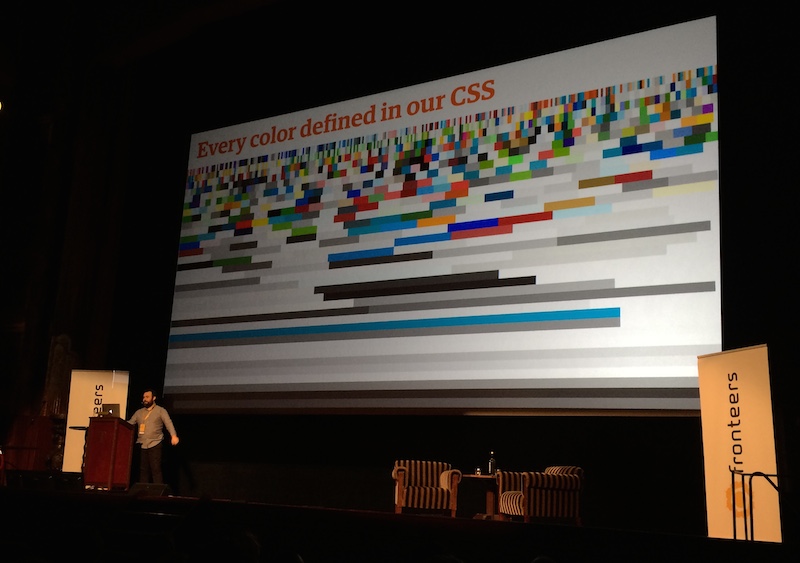
- They’re moving to SASS to get this under control, but will not be using all SASS functionality for now. Everyone needs to be able to work on the code (designers and developers) introducing complex functionality would hinder this. Also it’s easy to generate a lot of CSS with just a couple of lines of SCSS.
- A lot of the discussed tooling will be made open source in the coming months.
Some really great advice on how to regain control of your codebase.
Do we need to write markup? - Nathan Ford
Jake is a Progressive Enhancement guy so he informs Nathan he’ll shoot him in the face if things get too ugly.
- Nathan has been busy redesigning the webpages of CERN, the place where the web was originally invented by Tim Berners Lee.
- Tim intended HTML to be generated by machines. Also it was meant for content and above all meant to be read by humans.
- HTML translates the intend of the content so the browser can understand what it’s all about.
- Markup is not code (as it does not run anything). It’s more about design, it’s very easy to write. It’s also unforgiving (for instance, no error reporting when you forget to close a tag). So you don’t know if you’re doing things wrong.
- Markdown is called Markdown because it’s an optimisation of Markup.
- Can we make HTML easier to grasp for people in other professions.
- Nathan things we could look at HTML from a list point of view.
- He build a tool which you can use to create HTML trees by dragging and dropping HTML nodes. It enforces semantics and has validation build in, it’s an interface for learning and pushing smart defaults.
- This sort of tooling allows others in your team to also feel responsible for markup.
I’m glad to report that Nathan survived the talk without getting shot.
Pushing the real-time web forward - Arnout Kazemier
A talk about all sorts of bugs encountered when doing async client server communication.
- Long polling requests cannot take longer than 25 seconds. If they are still open after 25 seconds the browser will kill the request.
- Polling triggers loading indicator and will communicate mixed signals to your visitors. There’s iframe hacks around this, yes, iframe hacks.
- Caching is, as with everything, the big problem with asynchronous communication.
- There’s light at the end of the tunnel and it’s named WebSockets.
- WebSocket support available since IE10 and Android 4.3 so, basically pretty good.
Everyone is in a state of joy.
- Some really intense WebSocket bugs causing crashes on mobile phones and OSX. Also, press ESC on Firefox 20 closes the connection. On top of that, there’s all sorts of stuff blocking WebSockets: certain networks, load balancers, virus scanners block web sockets, it’s mayhem.
By this point, you can hear people sobbing.
- EventSource is a nice and very simple alternative but unsupported by IE11 (and earlier of course). Initial revision of spec is not cross domain though.
For now, it might be a good plan to use something like socket.io
- For the future, WebRTC might be the way to go.
An excellent summary of various methods to handle asynchronous communication. Also, very clear code samples illustrating ways around all the various bugs.
State of the Animation 2014 - Rachel Nabors
Jake
If you want to go full Michael Bay on your visitors, wrap your site in a blink tag.
Rachel speaks the words “blink” and “tag”, next thing you know, full system failure. A couple of minutes later we’re back on track!
- Animation improves adoption rate of new interfaces, change can be more easily comprehended when it’s gradual, especially for the young and elderly.
- Products with animation will out compete products without it, see Google Material Design Meaningful Transition videos. People will start to expect animation to be there.
- There’s some excellent animation libraries out there:
- GSAP, GreenSock Animation Platform, previously a flash library.
- Velocity.js, An alternative to jQuery Animate.
will-changeis alternative for translateZ(0) which is kind of a hacky way to promote elements to there own render layer.- Animation API it seems is not ready for production yet.
Some great consumer insights and tips on how to work with animation as a team.
Gaming in the browser - various speakers
Thomas Palef - LessMilk
- If you’re a developer and gamer, try to make your own game, it’s a great experience.
As someone who build a game as well, I can advice you to do this, it’s an awesome adventure. You’ll learn a lot about code and interaction patterns. Also, you can tell people you’re a game developer, that rings bells.
- It can be tough to pick the right game engine, writing you’re own is an option but is a big undertaking.
- Advices to use Phaser to create HTML5 web games, it has a lot of features and is currently growing in popularity. That’s important because that creates an environment where people can help you with any questions you might have.
I’ve personally played around with Phaser, it’s very good, has a lot of ways to create various kinds of games out of the box. Also lot’s of example projects, which will come in handy if you’ve never attempted to create a game before.
- Don’t set your goals to high, try to make something small so you’ll finish it in time and you’ll stay motivated to make your next game.
If you do plan to write something big, tell friends and family you’re building a game. They’ll keep asking you how it’s coming along, game development is something a lot of people find very interesting I find.
Luc Bloom - Blue Giraffe
- The web is a great platform. You can reach a lot of people. There’s no install required and it’s a new market, so lot’s of things to explore. Also, lots of devices to think of.
- As native c++ developers there were a lot of concerns about frontend development, like security, DRM, offline play, performance, javascript learning curve, return on investment.
- Also decided to develop there games with Phaser as it was widely used already.
Dominic Szablewski - Phoboslab
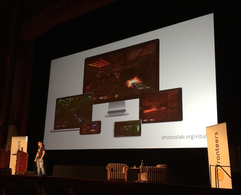
- Wanted to build a first person shooter in 7 days, but missed deadline by a year. Resulted in Xibalba, which, because it’s a web game works on a wide range of devices.
- Demos ImpactJS the engine powering Xibalba. Very cool stuff, awesome map editor and a lot of features to work with.
- Shows how to quickly create a secret room with a rocket launcher. Then cheats his way through the first level of the game, what a bastard, those Maya Death Gods never had a chance.
WebRTC: a front-end perspective - Shwetank Dixit
- Shows old-school “lock screen” on land line phone.
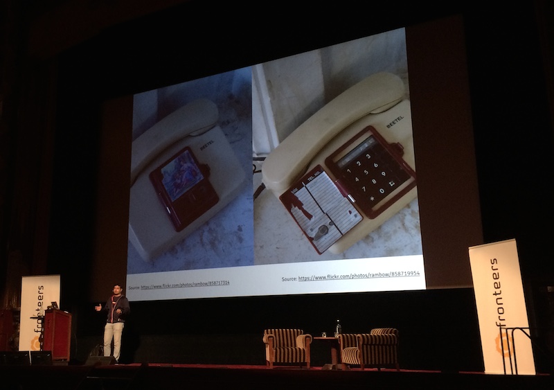
- In remote parts of the world people access the web over wireless, they never had land lines and probably never will.
- Sqwiggle uses WebRTC to allow you to communicate and collaborate with others on the web.
getUserMediacombined with CSS filters is an easy way to create nice effects.- Shows a demo where audio is processed and where volume controls a rotating CSS animation. If you want to do actual speech recognition PocketSphinxJS might be interesting to look at.
- Shows demo where a word is written by pointing at letters using a webcam.
navigator.getUserMedia( … )will becomenavigator.mediaDevices.getUserMedia( … ), also this new API will be promise based.- Upcoming Media Stream API will allow camera control, think of white balance, zoom, exposure and red eye reduction.
- It’s a challenge to get user permission to access the camera or microphone. The consent dialogs are not very visible, users tend to ignore or close them quickly. A lot of sites use an explanatory text to make you aware of the choice they have to make to use their service.
- If you’re on HTTPS the browser will remember the choice.
- An other part of WebRTC is RTCPeerConnection.
- Web RTC Glossary contains a list of acronyms used in the WebRTC docs.
- DataChannels provide a way to deliver low latency high performance peer to peer connectivity.
- They work very similar to WebSockets. Offer a lot of control over connection, for example, ordering of data packets and amount of retransmits.
- Currently no support in IE and Safari.
Maybe in a decade or so we’ll be more lucky.
- ORTC is a possible future replacement for WebRTC. It might also be called WebRTC 1.1, this is as confusing as it gets.
Offline First: Faster, more fun, and more robust (web) apps - Alex Feyerke
- Works on Hoodie which is a framework that allows you to quickly and easily build web apps. Also, all the apps build with Hoodie are offline capable by default.
- Shows Microsoft and Google future visions. Explains they are a bit unrealistic. For instance, the future Microsoft paints contains people working everywhere and lacks self driving cars. While Google’s only contains happy people doing happy stuff in their happy lives. Also, in both videos, all technology works flawlessly.
- Reading tip Alex gives us: Tobias Revell Critical Design / Design Fiction
- British Post Office future vision of the 60s for the 90s is a closer match. They’ve got a lot of stuff right, also, they focus on the mundane, things go wrong in their vision, they don’t sketch a perfect world.
- Mobile is normal, no connection is normal. Connections fail.
- Being offline should not throw errors, it’s a fact of normal life. It’s a different state your app can be in. Having a connection is an enhancement.
- Our web apps should work offline. And to do that, you have to start at offline.
- To be offline first you have to embrace Progressive Enhancement.
- You need to make the apps data assets and itself offline available.
- Hoodie apps only talk to a local hoodie store object which talks to
localStorage(could store somewhere else also) which is synced with a REST service. So if the REST service is not there, a part of the data still is locally available. - The communication is done only with Messages and Tasks, the store throws events when things have changed or a message arrives.
- It uses CoucheDB to sync data between client and server.
- To be offline first, you need to tackle syncing, Alex tell us this is tough. But luckily Hoodie solves this for you.
- People take screenshots of their apps because they don’t trust the app to retain their data.
- There are still a couple of hurdles to take with offline first: — Save vs. sync, how do you communicate these different states to the user, are you going to use different labels or maybe different colours. Do users understand syncing? — Order of Messages might get jumbled / meaning might change or messages might appear out of view when synced. There are interesting UX problems to solve.
- By going offline first we can easier compete with native apps. Offline apps feel faster, more robust, and as a result give a better experience.
- Explicit saving is not required, it’s done automatically.
- Offline is the new standard. Progressive Enhancement has a new starting point.
It’s a bit tricky though as javascript is required for syncing. Still we could store content offline with app cache and layer on server syncing and certain interaction patterns as an enrichment.
- Even with increasing network coverage offline first will stay relevant because there will be glitches. For instance when large groups of people come together and there’s just too many connections.
And that’s it for day one. A great start to a great conference.
Day 2
Making Twitter UI infrastructure - Nicholas Gallagher
- Twitter has a lot of apps they’re working on, Tweet Deck, Analytics, Ads, Vine, Twitter itself and Mobile Twitter.
- Engineering on Twitter user number scales can be really expensive.
- There’s 3500 people working on Twitter apps, among those are approximately 1000 engineers.
- It would be inefficient to build each new app from the ground up, it’s not cost and time effective
- The UI Infrastructure project at twitter has been set in place to enhance efficiency and allow people to use their time to be creative instead of reinventing the wheel each time.
- Focus during this infrastructure project is on outcome and process not on tooling.
- They’re not aiming for perfection but for flexibility.
- Each component is a highly cohesive functional building block. Creating components allows individual testability instead of having the test entire apps. With components it’s also easier to share task among team members, people can take responsibility over a certain component.
- Not creating a lot of tailor made stuff, custom things hinder portability and adoptability.
- Everything should be documented because the original creator is not always available and might have even left the company. Or might have been hit by a truck.
CEO of HP
if HP knew what HP knows we would be 3 times more profitable.
- Analogy of a Clock Radio. When taken apart, it’s transitors / capacitors / speakers / wires, not raw materials. That’s what we’ve been doing on the web, we’re using raw materials but should be using the individual components.
- Each component has an input > output just like the components you find in a Clock Radio.
- A component exposes slots where other components can be inserted in the DOM. This sorta resembles the functionality of the shadow DOM.
- They’ve setup a “node_modules” and a “web_modules” folder.
- There’s no hierarchy in the “web_modules” folder, all modules are contained in their own folders.
- The component folder contains all CSS, JS, tests, templates and readme related to the component.
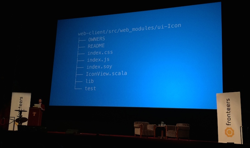
- Use WebDriver to test component functionality across browsers. Do end to end testing with theintern
- Use WebPack to bundle modules and create optimised static files.
Takeaway, it’s time to restructure static source files in to “web_modules”. Also a fantastic analogy for components.
Optimizing web performance - Dave Olsen
- Average weight of a homepage today is 1.8 MB. That’s more than a floppy disk.
- Responsive Design is not a cure all. There’s a lot of Responsive Design based websites out there whose footprints are way too large.
- Users expect your website to load fast no matter which device they are using. Less than 5 seconds to load or else people leave.
- 300ms delay on page load is 5% higher bounce rate.
- Mobile-first means Performance-first.
mobile first
offline first
performance first
content first
Okay guys, who's first. Pick one.
#fronteers14
— Rik Schennink (@rikschennink) October 10, 2014- Performance issues caused by Responsive Design.
display:none, sending data, then hiding is bad.- Sending big images and then shrinking, is sending unnecessary bits and bytes.
- Downloading scripts that are not necessary for current view.
- Page Speed Insights helps you analyse your website for multiple devices.
- Everyone should follow the Website Performance Optimisation course at Udacity.
- WebPageTest, just use it already, it’s amazing and it’s been here for years.
- Set a Performance Budget. By defining the minimum time a page should load in you can deduct the maximum file size. John Cleveley talked about this at Mobilism 2013
- Server side quick wins:
- Browser cache
- CSS and HTML(!) compression
- AJAX requests are not as fast as you might think, you could leverage perceived performance by putting HTML in script tags.
- gzipping
- Image quick wins:
- Avoid images, compress images (people are not really worried about artifacts), use
srcset. The<picture>element should only be used to serve art directed imagery though. - leverage tooling like Gulp and Grunt to optimise your static files, also imagemin, image-resize, sprites min, svgmin, google-cdn, uglify, and the list goes on.
- Javascript quick wins:
- Use less Javascript, less Libraries, look at MicroJS.
- Avoid reflows and repaints.
- Use Touch or Fastclick to prevent 300ms touch delay.
- Leverage the power CDNs.
- Use Spof-o-Matic to measure SPOF. SPOF-o-Matic detects likely third-party single points of failure.
- Optimise for the critical rendering path, get everything at the top of the page in view as fast as possible. Then lazy load the rest.
- “Politically we had to have a carousel.” That just says it all.
By this point, I’ve given up taking notes, there’s just too much juice in this presentation to keep up. The slides are really extensive luckily.
In short, excellent talk, ridiculous amount of information.
Animating SVGs with CSS and SMIL - Sara Soueidan
- SVG is XML but for creating and animating 2d vector graphics.
- You can animate SVG using CSS, SMIL or JavaScript.
- Only a subset of SVGs presentation attributes can be set in CSS
- SVG2 will unlock more properties.
- Can have style blocks in your SVG, and externally, just like in HTML.
- Transform origin in SVG is different than in CSS:
center,centervs0,0. - Need to use percentage and pixel values to have
transform-originwork cross browser (Firefox does not support percentages). - Not all SVG properties can be animated using CSS, in those cases you can use SMIL.
- There’s a great support table in the presentation showing how you can embed SVG, and which things work in which situation.
- SMIL supports event handling and animation synchronisation.
- SMIL does not work in IE.
- SMIL animations are set up using tags so are easily readable by humans.
Sara shares a lot of in-depth information on how to setup animations in the various techniques described. If you’re wondering how to animate something, anything, in someway, in SVG, watch this presentation.
- Did you know that you can adjust
animation-timingper keyframe? I didn’t. Thats pure gold right there.
Sara is going to do SVG performance tests and will be sharing those in the near future.
I’ve never learned so much web things in such a short timespan.
This is the web platform - Paul Kinlan
- The web is changing really fast, new browsers are released on ever shorter intervals, how to deal with this ongoing change.
- AppCache arrived and got immediately shot down by Jake Archibald, it’s very buggy.
- ServiceWorker gives more control than AppCache.
- ServiceWorkers allow you to respond to various events and interact with all stuff the browser is doing, also, run stuff in the background.
- Once we have our app running in the background the page itself just becomes the view. Our app does not even require a view then.
- Also would pave the way for the physical web which would allow you to interact with objects via urls.
- Google is doing deep app indexing, search results link directly to app when clicked. I guess they test if you have the app?
- caniuse.com data is in JSON format and can be accessed via the Can I Use - GitHub repository. This allows you to do all sorts of data analysis on it.
- iwanttouse.com allows you to see how many users can use a specific feature you want to use.
- Revenue generated by IE8 users is holding us and the web back.
- Don’t work with IE8 as your baseline, use modern features make content accessible on IE8.
- Mobile is growing rapidly and supports a lot of fantastic modern CSS features.
- Raise your prices for IE8, developing for IE8 adds a lot of complexity for your internal infrastructure, virtual machines, test scripts, legacy code, impact on maintainability.
- Developers are dropping accessibility support in favor of IE8 support which is a really bad thing. Percentage wise there are more users with disabilities than people using IE8.
There’s more users with disabilities than people using IE8.
Still, we tend to drop accessibility in favour of IE8 support.
#fronteers14
— Rik Schennink (@rikschennink) October 10, 2014At this point, Paul takes a small moment to try and burn his retinas with his laser pointer.
- Support latest browser versions, latest-2 is good, latest-1 is better.
- The web platform currently has a great set of features but not all the right ones for a lot of mobile use cases. Think of push, camera, sync, orientation problems.
- mobilewebappsftw.tumblr.com a collection of great mobile web applications by Paul, send in quality apps, he wants to know what is being created around the world.
- github.com/paulkinlan/cli-caniuse allows you to access caniuse through your command line.
- Pauls prediction is that the web, or certain parts of the web, will partly move out of the browser.
Excellent talk, great insights, some stuff we all should be doing right now.
Using agile to bake in accessibility - Meri Williams
- At age 15 Meri was part of building South Africa’s first satellite, once you’ve done that, it’s all downhill from there.
- She’s not a frontend dev, not an accessibility expert, but a CTO. An awesome CTO I’d say!
- Passionate about accessibility. With some family members having serious disabilities she recognises a lot of problems they encounter.
- Accessibility is not only about design and tech but also about the content, use simple language whenever you can, don’t complicate stuff.
- An alarming amount of people have trouble reading.
- Can’t delay accessibility to the end, it needs to be part of your core process.
- How to do this:
- Write down your team values.
- Refactor whenever you touch.
- Leave things better than you found them.
- Define “done” appropriately.
- Do accessibility testing katas.
- Talent is Overrated and Outliers are some excellent books to read on this subject.
- Various Deliberate Practise models to look into:
- Sports Model, analogues to conditioning.
- Chess Model, what did the grand master do?
- Music Model, chunking & mental rehearsal.
- Ask yourself, is my work designed in a way that makes it an effective deliberate practise.
- Do retrospectives instead of post-mortems, something has to die to do a post-mortem, that’s never good.
- Accessibility is not an optional extra. You would not charge extra for testing would you?
A really insightful and amusing talk.
Choose your own JS adventure - Kyle Simpson
Kyle immediately drops in the lounge area, kicks of his shoes and has them deported of the stage.
- Everyone at the conference has written code that does not work without knowing why.
-
Everyone at the conference has written code that worked without knowing why.
- Kyle has been writing free books on JS which can be found at youdontknowjs.com
- Instead of discussing whitespace vs. tabs and semicolons vs. no semicolons why not solve this in a tool. Kyle is working on a configurable two way formatting tool to fix this.
- SweetJS provides macros to javascript developers. Currently being adopted by the mozilla foundation.
- ES6 brings block scoping with the
letkeyword. It’s not avarreplacement though. You can and should use the two next to each other. - FoilScript, A new dialect accent variant of JS that fixes the sucky parts but still looks and feels like JS.
- Literalizer applies heuristic rules to identify the complex literals in javascript.
!(“foo” in bar)reads odd, his tools allows you to write(“foo” !in bar).
Kyle is demoing various javascript constructs that could be solved with these macros.
- So instead of switching to a whole different language we should just alter small parts of JavaScript.
- Kyle calls this two way conversion thing: “Inversible Transforms”.
- Kyle gives mad props to the ES6 group, then proceeds to totally annihilate them on the
classkeyword. Amusing stuff.
If you’re fighting with JavaScript, who isn’t, this talk is for you.
Scaling up and down: evolving your testing strategies - Pete Hunt
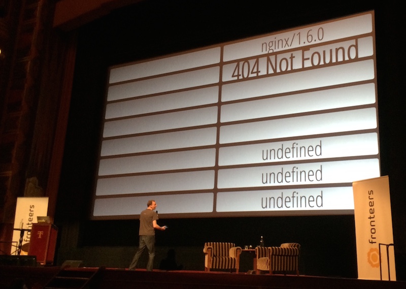
The raffle goes horribly wrong and shows all signs of a failing JavaScript app. Various undefined values show up, Jake, tries to salvage the situation by checking if “undefined” might be a very common name in the Netherlands.
- Three questions to keep asking yourself in all stages of a project:
- Is there a defect?
- How bad is it?
- How can we fix it?
- In an agile workflow the problem is slowly understood and therefor less mistakes are being made, resulting in less money and time wasted.
If you want to know when you should be testing what using which test method this is the talk for you.
Dream big. Think small - Petro Salema
- Kicks of with dramatic story of Death, Destruction and wrongly interpreted statistics during WW2.
- When your users are dying on your system (piloting planes being shot down) you’ve got a usability problem.
- No revenue in the balance, if they lost a user they lost a countryman. Losing the project meant losing the war.
Pretty dramatic stuff. But such an interesting story when looking at things from a data point of view.
- Accessibility bias means your hindsight limits your foresight.
- You won’t get a better answer than the question you can ask, it’s all about asking the right questions.
- Nothing is harder to overcome than accessibility bias because you can’t ignore your experience.
- An irrelevant feature won’t generate issues because its simply not used.
- In software we boobytrap anything with analytics so we know what everyone is doing with our product.
- Analytics in themselves do not save us, they might even make the accessibility bias more prominent.
- The goal is and should always be user experience.
- Innovation is about using existing capabilities in new ways, look at the Oculus Rift, build in a garage with existing things by a young tinkerer.
- Awesome explanation on what Beeping is and how it works in real life.
- Downloading apps and extensions is about shopping for super powers, as a user I want to empower / optimise my life with additional functionality.
Don’t start a revolution, enable a revolution to start.
Vivid, imaginative and almost relaxing talk. The relaxing part could also originate from the fact that this was the last talk of the day.
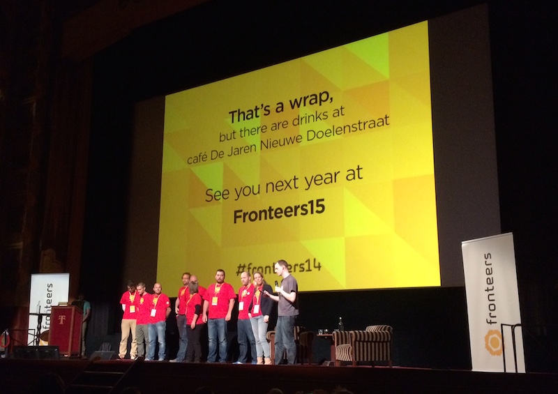
That’s it, Fronteers 2014, what a fantastic conference this was. Great food, great speakers, a great venue and above all, great people.
An insta-attend for 2015.